All Products in Timestone Software (with the exception of digital and retouching products) are the result of templates created in the Timestone applications.
Each of the applications includes a Template Designer that enables the user to create templates relevant to that application. The templates are saved as files and use different filename extensions depending on the type of template created.
Application | Template Types | File extensions |
|---|---|---|
NeoPack | pack layouts item designs package templates for IOS | .plt .pit .pkg |
NeoComposite | page layout subject block board | .cpt .cst .cbt |
NeoGroup | group template | .tgt |
Fulfill | order headers | .oht |
Launching the Template Designer
In all applications, the Template Designer is launched by the F10 function key or by selecting Mode>Template Designer from the main menu.
The Template Designer tools and interface
Many of the Template Designer’s tools and features are common from app to app, even though the template being created differ.
The discussion that follows focuses on the Template Designer in NeoPack.
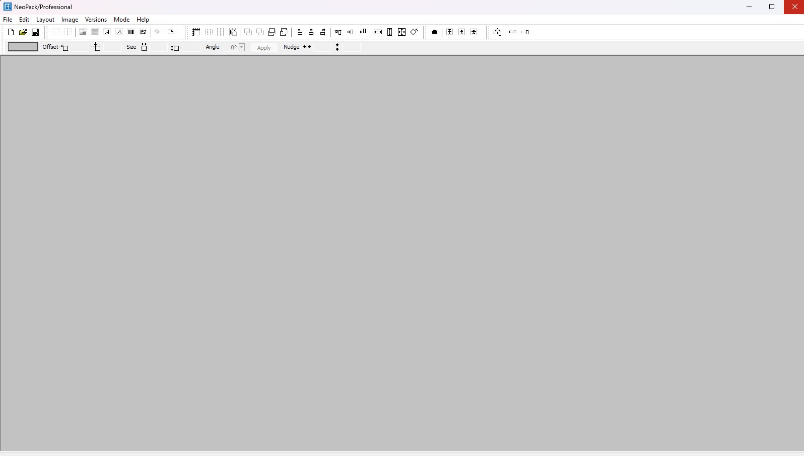
Figure 1: The main template designer screen
The Template designer is divided into 3 main parts:
The Main Tool Bar
The Dimensions and Units Toolbar
The Design Canvas Area
NOTE
Depending on whether the user is creating a layout or Design Item, some of the buttons may be unavailable for use.
The Toolbars
Several toolbars allow access to various options when designing templates.

Figure 2: Template Designer tool Icons
The File Toolbar
The File toolbar includes icons for the common File menu options: New, Open, and Save.
The Place Object Toolbar
The place object toolbar allows users to place various objects onto the template. There are 10 object types:
Object | Icon | Description |
|---|---|---|
Add Hole |
| Defines where the images will appear in the template. |
Add Grid |
| Defines a Grid that can be filled with other item elements |
Add Graphic |
| Defines where various graphic elements will appear in the template. Graphic objects created with this tool are static |
Add Fill |
| Add a filled rectangle. The fill can either be a solid colour or a Fountain (Gradient) between two colours |
Add Text |
| Defines where text will appear in the template. Text can be static or contain special variable ‘@’ codes. Text automatically scales to fill the defined text box. |
Add Curved Text |
| Similar to the above, but the text is on a curve. |
Add Barcode |
| Defines where a barcode will appear in a Layout. Note that the barcode object is not available when creating a sizeable pack item – the item must be a fixed-size item |
Add 2D Barcode |
| Define an area for a 2d Barcode (like a QR Code) to appear in a layout |
Add Labeled Image |
| Places a box that will be replaced by an image, e.g., a logo |
Add Page |
| In pack layouts can call a formed composite or group page. In Package Templates, can call a product from the package. |


The Display/Snap Toolbar
This area consists of the icons for Show Rulers, Show Cut Marks, Show Grid, and Snap to Grid (shown in Figure 2, from left to right).
Figure 2: Display/Snap Toolbar
These are useful options to help size and position objects in a template: A ruler, Grid, Grid snap, and Cut marks.
The ruler and grid are visual aids for sizing and positioning objects in a template. Enabling snapping assists further by snapping the object to gridlines or other objects on the page. As an object is sized or moved on the template, it will snap from one gridline to another, ensuring accurate size and position.
Cut Marks
Cutmarks can be shown or hidden using the Show cut marks icon, as seen in Figure 2 above.
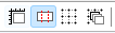
To add a cut mark to a template, select Edit> Cut Marks… then indicate the orientation of the mark and its location on the canvas.
Figure 3: The cut marks menu
The Object Layer Toolbar
Objects placed into a template can be positioned in layers, making it possible to make the various objects appear behind or in front of each other. To change the layer order of an object, select it, then choose the desired layer order button.
It consists of a few different areas with their related tools:
The Move Object Area: This area consists of the icons for Move Up, Move Down, Move to Top, and Move to Bottom (Figure 4) in that order.
Figure 4: Move Object Icons
The Align Object Area: This area consists of the icons for Align Left, Align Vertically, Align Right, Align Top, Align Horizontal, and Align Bottom in that order.
Figure 5: Align Object Icons
The Match Object Area: This area consists of the icons for Same Width, Same Height, Same Size, and Same Angle in that order.
Figure 6: Match Object Icons
The Set Mask Option
Masks are image files created in an outside editing software that allows the user to create image transparency in the finished prints. These files allow more complex transparency effects, such as a soft-edged blend or a semi-transparent overlay. A mask can be applied to any graphic object placed in a template

Figure 7: The Set Mask Icon
Further Reading: Using Masks
Masks are used to apply blending and transparency effects to images and graphics.
The Scaling Options Toolbar
When placing image objects into a template, the user can control how the graphic is scaled within the object box. This is useful to ensure an image is completely displayed but not distorted.
Figure 8: Scaling options
There are 3 options:
Set Image Fill- This will clip the image to fill the box while maintaining the aspect ratio.
Set Image Fit- This will fit the whole image in the box while maintaining the aspect ratio.
Set Image Stretch- This will fill the image box by stretching the image to match the box, distorting the aspect ratio.
The Orientation Toolbar
The orientation bar has different uses depending on whether the user is creating customer version templates, custom version templates, pack layout templates, or item templates. When designing items, both portrait and landscape versions can be created using the same template within the same file. This is an alternative to having separate templates for each orientation and then locking the image hole to a certain orientation.
Using the toolbar, the user can have a single template file that houses both versions. Click the Different orientations icon to create the secondary version, and then use the Horizontal and Vertical Version icons to swap between them.
Figure 9: The Template orientation icons
NeoPack will automatically select the correct orientation for a portrait or landscape image when selected.
TIP
The orientation tool is helpful for indicating that an Item design - “ .pit” (PIT) file - has two versions based off the image orientation. Pack Layouts - “.plt” (PLT) files- will choose the correct version of the template based off the image orientation, matching the long and short sides of the image to the item template and then rotate to fit the layout template.
Further Reading: Orientation Specific Templates
A user can create a single Item design that will automatically fulfill the correct orientation image with a matching orientation template.
The Dimensions Toolbar
Objects placed into a template can be positioned and sized exactly using the Objects Dimensions toolbar. To set the size and position of an object, select it, then enter the desired values to the toolbar. Once done, click the Apply button to set the values. The Offset values set the position of an object’s top left corner.
Figure 10: The Dimensions Toolbar
Further Reading: More on Templates
Templates are a basic building block of an offer and are the blueprint for final printed products in Timestone’s applications.
Creating a Basic Print Template
The efficient and organized storage of templates is one of the most important administrative considerations for a user.
The Template designer allows for several types of graphic elements to be included in an item design.
In addition to print templates, the user can create Customer versions of templates that will be displayed in Timestone’s Online Ordering System.